top of page

Profile & Household Management
Timeline
September 23 - May 24
Role
Lead UX Designer and Researcher
Tools
Figma
Qualtrics
Confluence / Jira
The Profile & Household Management project was an initiative to double down on the theme of families being the center of SportsEngine. The goal is to set the foundation of persona data across the suite of products within the SportEngine Ecosystem.
This project entailed a full overhaul of our backend architecture for profiles and accounts along with a complete redesign of our DTC platform’s profile and account-related pages. Setting us up for reusable components, responsive pages, and a slew of new features downstream.
Problem
The landscape of SportsEngine Profile and Household Management is very disjointed. My SportsEngine (MySE) does not have a unified way to see and manage your household and profiles, as users would expect. To set SportsEngine up for the future needs of our business and applications, we must provide users with a way to manage their own profiles, their children’s profiles, as well as their accounts.
I was tasked to redesign these pages to meet our users' needs and alleviate some of the cognitive load that users encounter when using our platform.
Understand our user’s needs
To begin a project like this is a huge undertaking my first step was to audit the current profile and account experience in MySE. From there I mapped out a list of opportunities and insights that helped begin ideating solutions.
Within the MySE platform, we used Qualtrics to gather User feedback and insights. From June - December 2023 an overall experience survey was run. This allowed me to gather some information of what were our users' largest pain points within the account and profile experience.
- Most visit MySE to complete membership requirements and manage their household & accounts.
- Manage account/Household and Complete membership requirements have the lowest task completion and satisfaction rates, and the most difficulty navigating MySE.
- Over 60% of MySE users come from a mobile device and many of those users commented that they were unable to complete their task due to device responsiveness. Many pages were cut off or unscrollable.


I also ran a usability study within Userzoom to access how our users navigate MySE through a series of tasks such as: finding where to manage a profile within their account, editing profile information, and adding a guardian to their account. This study allowed me to see in real time how users interact with the current navigation and page setup in MySE. The results of the study allowed me to then assess where the biggest user pain points were found in a few of the user journeys within MySE and further influenced my design and information architecture recommendations.


Lastly, after completing my research and collecting the data, I then synthesized the data, pulled together insights, and drew major themes that our team wanted to tackle within our first milestones in this project.

Insights
1. Editing Information within a profile
- Parents need to easily find where to edit information regarding
- child’s info
- their info (mainly communication pref)
2. Adding/expanding household to add additional children or account owners
- Parents need an easy-to-modify/add to their household
- Parents need to add a spouse or teen easily to the account so they can receive communications from coaches etc
Themes
1. Finding and Editing Profile Information
- Many issues arise when profile information is incorrect.
- My goal is to be able for our users to easily navigate to where they can modify the profile information.
2. Adding/ Expanding Households
- A common user sentiment was that they anticipated that they could easily add members to their household and grant other adults access to their sub-profiles.
Objectives & Goals
With the MySE platform having over 500k monthly users. I wanted to define goals for this project to make sure my team and I are aligned on what the objectives we are trying to solve for our users.
Make it easy
Improve management of profiles and households.
Make it accessible
Redesign the pages of MySE to be responsive and to meet accessibility standards.
Make it modern
Update UI and create reusable components.
- Elevate most common user actions to top-level navigation items.
- Create many avenues for our users to find and complete the major tasks. To meet their mental models.
- Over 60% of MySE users come from a mobile device. Our objective is to make sure that MySE functions well on all devices and screen sizes.
- Design new and redesigned pages in MySE to be accessible and meet WCAG 2 standards.
- Modernize the UI within MySE by creating updated components and establishing new design patterns.
- Redesign existing pages such as memberships, credentials, and others.
Building out the components
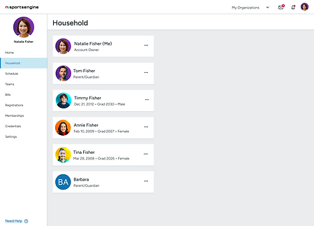
The Profile Cards
The MySE household consists of two components: The profile cards and the profile itself. Profile cards are on the main household page and are meant to give a glance into all the members within your SportsEngine household.
The existing profile cards were designed in a card structure where it gave some profile information (name and contact info). From the research, I discovered our users did not find the information on the cards particularly useful. On a mobile view, these cards took up a lot of screen real estate causing our users to scroll to find the relevant information.
Another issue was that there was a small touch target on the bottom of the card where a button was placed to open the profile. Many users on mobile devices struggle to even open the profile once they find the person they are looking for.

The new profile cards I created were designed to be optimized for a mobile viewing experience while still functioning extremely well in a desktop view. To fix the touch target issue the entire card is clickable with two separate touch targets: the left 3/4 of the card opening the profile and the right 1/4 opening a menu with additional actions such as deleting a profile.
The cards followed a similar structure to the original consisting of the profile name, avatar, and lastly, information that the users found relevant to the purpose for visiting the page. I created two versions of the profile card (the account owner and the sub-profile)
The account owner card consists of no additional personal information and the subtitle just indicates that they are the owner of this account. I made this decision since the majority of account owners are parents or guardians, who are registering their children for sports teams. Therefore, I wanted to distinguish between an athlete profile vs. a parent.
The sub-profile or athlete profile card differed from the account owner card by including different information in the subtext. This information was the profile’s birthdate, graduation year, and gender. I chose that information because it is the most important information for the account owner since it directly correlates to the athlete’s eligibility for the sports they participate in.


The Profile
Originally the MySE profile was only navigated via the “view profile” button on the profile card. Once a user has entered the page the profile consisted of three elements: profile information, guardians (adults who have been granted access to this profile), and membership cards (a requirement by some organizations for athletes to participate in sporting events).
This profile page was not responsive and on mobile, the guardians card and membership cards were inaccessible due to the pages not scrolling properly. The profile information was held in a long-form field that could only be editing once clicking the edit icon at the top of the card.
The existing page was inaccessible to most users especially when accessing it from a smaller device and was not optimized to be read properly from accessibility devices such as screen readers.

When redesigning the profile I kept two things in mind:
1. Optimizing design for smaller screen sizes.
2. The idea of “many doors to one room”, meaning users all have different mental models of how to navigate a site. I wanted to make sure that this profile was accessible from many places and not just the profile card.
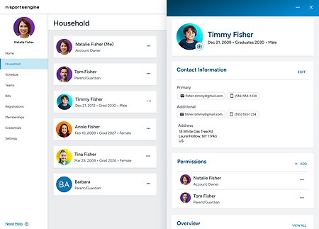
This is how I came to the idea of designing the profile within a side panel. Therefore on desktop, the users could easily click between profiles to view and edit the information without leaving the context of the greater household page. The side panel is also a reusable component and can be placed within different pages of our software. So users would not need to dig for this information in case they need to make changes or see certain information.
The profile itself has separate cards for all information regarding this person. The first card has profile information, second card has contact information. Both card's information is editable from a modal. The guardians card now renamed permissions shows at a glance who has access to this profile and the user can manage those individuals and invite new guardians directly from the card.
Lastly, a new addition to the profile is the overview card. This card houses all information on the program regarding the team they're rostered on, and the organizations they're a part of. Along with membership and registration history. All this information previously lived on separate pages which led the user to dig for all this information and increase the cognitive load.


The Page
Now that the individual components that made up the household and profile pages were designed it was time to put it all together. When redesigning the page I wanted to create a two-column structure that would that would scale well depending on device size. On desktop, all profile cards were visible and the side panel would open up along side it so the account owner could click through all profiles and the content would load. On mobile, the cards would take up the entire screen and when the profile was clicked the side panel would open up over the top of the cards.
Orginal household page

Redesgined household page
Redesgined household page mobile view


Release
Prior to release we wanted to check in and make sure we accomplished our goals. We tested accessibility with Fable to make sure these new pages were accessible and met WCAG standards. We did extensive QA testing and had many employees test this on all devices to ensure it functioned properly before release. My product team also met with content to ensure all help documentation was properly updated to help users adopt the new patterns, along with meeting CS and demoing the new pages so they understood how it functioned to assist our users. Lastly, we meet with marketing to strategize our release plan.
This project was released in May 2024. We had a marketing campaign that included a pop-up that appeared on MySE to all users when logging back into their accounts for the first time since release. This pop-up displayed information about the new features and encouraged users to check out our new and improved pages.

Example of pop-up users saw
Measuring impact
It was important to my product team to not only release these redesigned pages but also measure their success. We implemented Qualtrics into MySE to not only run feedback surveys but also to use their analytic tool DXA to monitor the performance of the new pages. Along with utilizing Qualtrics, we measured success by the user traffic to these pages and issues/bugs logged from CS.
Qualtrics Overall Experience Survey
- A baseline overall experience survey for MySE ran from June - Dec 2023.
- We re-ran the overall experience survey to measure user feedback.
- Success would be that the data is trending better than last year (user sentiment scores, # of issues reported, task completion, etc.
Qualtrics DXA
- We implemented Session Replay to see user sessions and assess how users are interacting with the new pages and features.
- Session replay will allow to see where major frustration points for users are within MySE.
- Since releasing DXA we were able to catch 2 bugs/issues unrelated to the Profile management work and get it fixed.
Page views and bugs/issues logged
- Over 380k unique users since launch.
- Over 2.3 million page views
No known bugs/issues logged related to the release.
Numbers are as of June 14, 2024
bottom of page